 to drill down on chart reports.
A unique feature of Prospero is the ability to drill down
on reports to view the underlying data – including reports which are rendered as
Charts. You must define a drill down Segment structure on your Report
Definition’s layout tab in the Segment grid to use the magnifying glass icon
 to drill down on chart reports.
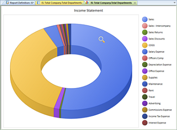
For example, the following Income Statement Report for total company sales is rendered as a doughnut chart. The magnifying glass indicates that Sales data is available for drill down.

If you have selected the “Show Hover Labels” checkbox on your report’s Chart View context ribbon, Prospero will provide labels on the chart or graph sections when hovering over an item (selection) on a chart or graph. This is in addition to your data markers or any legend you have defined. If this item is not checked, no labels will appear.
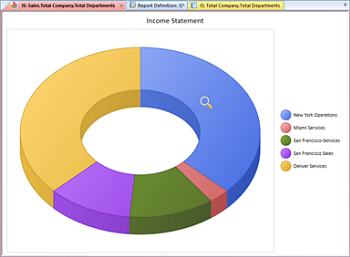
To view the specific underlying data via drill down, simply double-click on the part of the chart represented in the legend on the side of the chart report. In this instance, selecting the “Sales” component will drill down and render a new chart report for the underlying data.

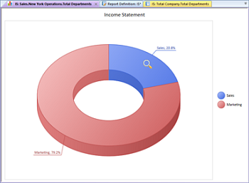
Selecting the “New York Operations” component will drill down and render a new chart report for the underlying data. Note that the Show Data Labels option has been selected at this drill down level and appear on the chart report.

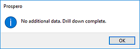
Lastly, as with standard column and line reports, you can continue to drill down to the lowest level of data and detail as defined in the Segments grid. The magnifying glass icon will activate over any item of information in your report where there is additional underlying data available for drill down. Otherwise, you will receive a message from Prospero that you have reached the limit of any available underlying data.

Note: Drill down on formula capabilities is not currently available for charts and graphs.